We build the moments brands are remembered for.
This is the working standard for how LACY MAXWELL presents itself: what the brand stands for, the language it uses, and the rules that govern how it looks. It is a living document and the reference of record.
Brand foundation
Lacy Maxwell Experiential is a full-service experiential studio. The mission and vision below are fixed language: they set the standard every other page in this document answers to.
To create human experiences that affect positive change, ignite insight, and inspire genuine connection between people and brands.
A world where every brand earns its place in memory, not by interrupting life, but by making it richer.
We chase the moment that makes someone stop and ask, "how did they do that?"
Built by hand where it matters. Nothing generic leaves the shop floor.
Epic ideas mean nothing without perfect delivery. We sweat the load-in.
No question too hard, no project too small. We say yes, then figure it out.
We move as one team with our clients. Their win is the only win.
The core idea
We build the moments brands are remembered for.
Lacy Maxwell Experiential began with one stubborn idea, that the most powerful marketing isn't seen, it's felt. From a small crew chasing bigger-than-budget ideas, we've grown into a full-service experiential studio staging brand moments across three continents.
We are not an agency that happens to run events. We are storytellers who happen to work in the physical world, turning a vision into a room people walk into, remember, and can't stop talking about.
The memory is the deliverable. Every decision, from a headline to a truss position, is judged by what it leaves behind.
It leads a deck, a proposal or a page. Set it as a display line, never as a caption or a strapline under the logo.
Do not shorten it to "unforgettable moments", pair it with a second claim, or set it in all caps.
Who we are for
Write to the primary audience unless the brief says otherwise. The secondary audiences read the same material; they are not a reason to soften it.
CMOs, brand directors and event leads with a launch, a tour or a flagship moment to land. They carry the risk and they answer for the outcome.
Creative and media partners who need a build partner that will not compete for the idea, and will not miss the date.
Site teams, fabricators and technical suppliers who read our documents as instructions. Precision matters more than personality here.
Naming and proprietary language
The name is the most commonly broken rule in the system. There is one written form per context, and no house variations.
| Display and headlines | LACY MAXWELL. — all caps, with the period |
| Running text | Lacy Maxwell — title case, no period |
| Legal and first mention | Lacy Maxwell Experiential |
| Internal shorthand | LME — internal only, never client-facing |
| Never | LacyMaxwell · Lacy-Maxwell · lacy maxwell |
Activation, build, load-in, show day and strike are our working vocabulary. Use them consistently in client documents rather than trading them for softer synonyms.
Client, then year, then moment: CLIENT-2026-LAUNCH. No nicknames in files that leave the studio.
Roman numerals for edition and brand dates, MMXXVI. Arabic numerals everywhere operational: schedules, call sheets, specs.
Messaging framework
For brands who refuse to be forgotten, LACY MAXWELL is the experiential studio that turns products and ideas into moments people live inside. Unlike agencies that rent attention, we design the experiences, and the emotion, that earn it.
We measure success in feeling, not just footfall. The memory is the metric.
Every activation is designed and fabricated from the ground up. No templates.
Big vision, obsessive logistics. We make the impossible look effortless.
LACY MAXWELL is a full-service experiential marketing studio. Through live events, brand activations, and immersive environments, LACY MAXWELL connects brands and audiences in ways that matter, staging unforgettable moments across three continents.
"The moments brands are remembered for."
It always seems impossible until it's done.
These five carry the brand on their own. Set them in Open Sans Bold, all caps, flush left, with one emphasised clause in Accent, and never more than one of the five on a single piece. Do not reorder the clauses, shorten them, or add a word. "It always seems impossible until it's done." keeps both its beats and, where space allows, its second line.
One line. LACY MAXWELL is an experiential marketing studio staging the moments brands are remembered for, across three continents.
Short. LACY MAXWELL is a full-service experiential marketing studio. Through live events, brand activations, and immersive environments, LACY MAXWELL connects brands and audiences in ways that matter, staging unforgettable moments across three continents.
Long. LACY MAXWELL is a full-service experiential marketing studio built on a simple observation: the most powerful marketing isn't seen, it's felt. Founded in MMXVI by a small crew chasing bigger-than-budget ideas, the studio now designs and fabricates live events, brand activations and immersive environments across three continents. Every activation is built from the ground up rather than booked from a template, measured in what an audience remembers rather than how many walked past, and delivered with the logistics to make a large idea look effortless on the day. LACY MAXWELL works with brand and marketing leads, agencies of record, and the venues and crews who build alongside them.
Voice principles
Bold, but never loud for its own sake.
We've done the impossible before. We write like we'll do it again.
We talk to people, not demographics. Warmth over jargon.
We paint the moment. Show the goosebumps, don't just claim them.
We say yes to the big idea and mean it. No hedging.
Tone by context
Same voice, different register. Set the tone before you write, not after the first draft comes back.
| Context | Register | Sounds like |
|---|---|---|
| New business pitch | Bold, vivid, certain | "Let's build something they'll never forget." |
| Client production notes | Plain, precise, warm | "Load-in starts 0600. Here's what we need from you." |
| Social and recap | Vivid, short, no shouting | "Three continents. One room at a time." |
| Something went wrong | Direct, accountable, calm | "Here's what happened, and here's the fix." |
| Recruitment | Warm, honest, unglamorous | "The work is hard and the rooms are worth it." |
Writing mechanics
The small rules that keep a set of documents looking like one studio wrote them.
Sentence case for headings, sub-titles and buttons. All caps is reserved for the display name, kicker labels and section titles.
Serial comma always. One exclamation mark per document, and only if something genuinely broke. No ellipses as suspense.
Spell out one to nine in prose, numerals from 10. Twenty-four-hour clock in production documents: 0600, not 6am.
Body copy sets flush left, ragged right, at 70 characters or fewer. No justification, no centring except on covers.
Words and phrases we use, and don’t use
"Let's build something they'll never forget."
"No question too hard. No project too small."
"It always seems impossible until it's done."
"Leverage our synergistic activation solutions."
"We deliver best-in-class brand experiences."
"Let's circle back on the deliverables."
The left set describes what happened in a room. The right set describes a category. If an adjective could sit in any other studio’s deck, it is not ours.
The logo family
Two members: the primary lockup, with a reversed version for dark grounds, and the monogram. Choose by the space you have, not by preference, and always build from supplied artwork.



Primary for anything with room to breathe, reversed on any dark ground. Monogram only where the name already appears on the page, or below the primary’s minimum size.
The mark's metallic taupe is fixed artwork colour. It is not part of the palette and must not be sampled for type, rules or panels.
Clear space and minimum sizes

The mark sits in a square. X equals one quarter of that square's height, held on all four sides. Nothing intrudes: no type, no rule, no image edge, no other logo.
Never smaller than these. Below the minimum, drop to the monogram rather than shrinking the lockup.
EXPERIENTIAL is the first thing to go. Once the lockup falls below 120px on screen or 24mm in print the word closes up and stops being legible, so use the mark on its own instead of setting type that cannot be read.
Logo misuse
Co-branding and partners
On client work the client leads. Our mark appears as the maker's credit, at a size that reads without competing.
Client mark first, then a 1px divider at the height of the smaller mark, then ours at no more than 70% of the client's cap height.
Where a lockup is not appropriate, use the words: "Experience by Lacy Maxwell." Set in Space Mono, uppercase, 11pt minimum.
Merged marks, our monogram inside a client's lockup, or our accent applied to their identity. Partner sheets need steward sign-off.
Color family
RGB 18 18 18
CMYK 0 0 0 93
RGB 245 244 242
CMYK 0 0 1 4
RGB 32 122 217
CMYK 85 44 0 15
RGB 110 110 110
CMYK 0 0 0 57
RGB 180 180 180
CMYK 0 0 0 29
Near-black authority. It signals confidence, focus, and premium restraint, the weight behind a Lacy Maxwell name on the wall. Used for type and structure, it lets everything else breathe.
Warm, gallery-white calm. It reads as openness and craft, the empty room before the doors open. Space is the luxury; paper gives the work room to land.
Charged, electric blue. It reads as trust and competence, and primes the open, imaginative thinking big ideas need: clear sky before the show, current in the room. Used sparingly, it makes every promise feel kept.
Neutral stone gray, the steady, grounding voice. It carries supporting copy and captions without competing, lending maturity and balance to the boldness around it.
Soft panel tint, quiet sectioning and rhythm. It divides the page without drawing a hard line, creating pace and hierarchy the way lighting shapes a room.
Approved color combinations
60 Paper · 30 Ink · 10 Accent. The accent is a seasoning, never the meal.
A page gets one accent moment: a rule, a number, a panel or a link colour. Not all four.
Grays divide and group. They never carry meaning, and they never sit under body copy as a highlight.
Accent on tertiary, tertiary type on paper, gradients of any kind, or a second hue introduced for a single campaign.
Accessibility and contrast
| Pair | Ratio | Approved for |
|---|---|---|
| Ink on Paper | 17.5 : 1 | Everything, all sizes |
| Paper on Ink | 17.5 : 1 | Everything, all sizes |
| Accent on Paper | 3.8 : 1 | Headings 24px and up, rules, icons. Not body copy. |
| Paper on Accent | 4.6 : 1 | Body copy and up |
| Secondary on Paper | 4.9 : 1 | Supporting copy, captions, labels |
| Tertiary on Paper | 1.9 : 1 | Rules and panel fills only. Never type. |
| Accent on Ink | 3.1 : 1 | Labels and rules only. Never body copy. |
16px minimum body on screen, 12pt in print, 24px on a 1920 by 1080 slide. Labels never below 10pt.
Status, progress and emphasis always carry a label or a shape as well as a colour.
Check the ratio at the lightest point of the image, not the average. If it fails, use an overlay from section 22.
Light and dark systems
Two grounds, one system. Light is the default for documents and reading; dark is for covers, dividers, environments and anything seen in a dim room.
Ink type, Secondary support copy, Tertiary rules, one accent event. Every rule in this document assumes this ground unless it says otherwise.
Paper type, Tertiary support copy, #3A3A3A rules. The accent lightens by one step for labels; it never carries body copy on ink.
Typography
Section titles and display lines. 200 through 600; Light below 24px only.
Headings, sub-heads and body. Bold for headings, Regular for copy, italic for quotations only.
Kicker labels, captions, specs, dates and credentials. Uppercase, tracked 16%.
A condensed, gothic-inspired sans, a modern reworking of the early-20th-century Alternate Gothic newspaper faces, redrawn for the screen. Its tall, narrow letterforms and defined edges command attention like a name on a marquee, the exact presence a Lacy Maxwell moment is engineered to create.
A humanist sans with open forms, a generous x-height, and a neutral-yet-friendly voice. Built for effortless legibility across print, web, and mobile, it keeps our storytelling clear and human, the warmth that balances Oswald's boldness.
Web: Oswald, then Helvetica Neue Condensed, then the system sans. Body: Open Sans, then Helvetica Neue, then system. Email: Arial as the body fallback, set deliberately rather than left to the client.
Inter, Roboto, Poppins, Montserrat or Calibri in a delivered file. If a licence is missing, ask rather than swapping the face.
Type scale and mechanics
The ratio holds: 72 display, 40 heading, 24 sub-head, 17 body. Sizes scale up for large format, but the relationship between them does not change.
minus 2% tracking
Accent
max 70 characters
16% tracking · uppercase
Secondary
Everything sets flush left, including button labels and display lines. No centring except on covers, and no justification anywhere.
16px body on screen, 12pt in print, 24px on a 1920 by 1080 slide. Labels never below 10pt.
For posters and signage, scale the whole ratio rather than the heading alone, and tighten display tracking to minus 3%.
Sentence case for headings and buttons. All caps is reserved for section titles, kicker labels and the display name.
Layout and grid
The structure is visible. Content sits in equal-width cells, sections are separated by 2px rules, and nothing floats: alignment and the weight of the dividers do the organising.
Twelve columns, 1180px maximum measure, 40px outer margin. Cells combine in equal fractions: halves, thirds, quarters, not arbitrary spans. Print documents use the same twelve columns at 0.5in margins; slides use twelve columns across 1920px with 110px margins.
2px Ink between major sections, 1px Tertiary between cells inside one. Content is separated by rules and alignment rather than by containers.
Cards, images, inputs and buttons are square. The only rounded object in the system is the app icon, and the platform applies that mask.
Sequences carry two-digit numbers in Accent at the head of the cell: pillars, values, sections. The count is part of the layout.
Generous vertical space between sections, tight space within them. A page reads as a set of blocks, not a stream.
Section padding is 100. Cell padding is 26 to 34. Nothing sits at a value off this scale.
Photography
Cinematic. Charged. A little surreal.
Our brand imagery is stylized and abstract, dramatic light, saturated color, and a charged sense of motion that stands in for feeling itself. We shoot the emotion of an experience, not a literal document of it. High contrast, a little cinematic, unmistakably ours.
People inside the moment, and the craft that built it: a crew at the load-in, a room filling, a face catching the light.
High contrast, saturation held, blacks deep but not crushed. Match every image in a set to the first edit.
Crop to the grid: images fill their cell exactly, square cornered, no border, no rounding. Full bleed is for covers only.
Stiff, staged stock. Empty venues shot as proof. Anyone looking at the camera mid-moment. Orange-and-teal grading.
Color overlays
Overlays pair photography with typography. Used on covers and at transitional points, they prepare the reader for a change of content. The sequence is fixed: full color, to black and white, then the color applied on top.
Accent and Ink. Secondary and Tertiary are not overlay colours, and two overlays are never combined on one image.
Paper or Ink display type only, following the combinations in section 15. Check the ratio at the lightest point of the treated image.
Covers, section dividers and campaign key art. Not in editorial galleries, and never on a photograph of one identifiable guest.
Iconography and graphic elements
Line only, 1.5px stroke on a 24px grid, round caps, never filled and never two-tone. Ink, Secondary or Accent. Icons label a thing; they never decorate a heading.
16px inline, 20px in buttons, 24px in a list, 40px as a section marker. Aligned to the text baseline, never floating above it.
Not part of the system. Not in marketing copy, not in the product, not in notifications.
Square ends, Accent fill on a Tertiary track, always labelled with the count as well as the percentage.
The nested triangle of the mark may be used as a divider or a repeating field, in Ink, Accent and Tertiary, always upright and never at logo scale.
The full logo as a background pattern, the triangle rotated or inverted, the nesting in a gradient, or a fourth triangle added to the set.
Interface and components
Square, 44px minimum height, label in sentence case. One primary per view.
Space Mono, uppercase, one word where possible. Status always carries a word, never a colour alone.
1px Tertiary border, Accent on focus. Labels above the field, never inside it as a placeholder.
Applications
Where the system meets the world. Each application uses the same grid, the same three faces and the same ratio: only the scale changes.
Ink cover with the display line, then light interior pages. 24px minimum type on a 1920 by 1080 slide.
Wayfinding in Oswald caps, Ink on Paper. Read at six metres before it reads as brand.
Photography first, one line of type, square lockup in the corner at 70% of clear space.
Square lockup, role in Space Mono caps, name in Open Sans Bold. Ink ground so it reads in a dark venue.
Text only: name, role, then "Lacy Maxwell Experiential". No image, no banner, no quotation.
Primary lockup top left, edition and date top right in Space Mono, 0.5in margins on the twelve-column grid.
Merchandise and apparel
Crew kit is working clothing, not merchandise. It reads as one team on site and it survives a strike.
Ink garment, monogram left chest at 70mm, screen print in Paper.
Monogram only, embroidered, 45mm wide. No wordmark at this size.
Primary lockup across the back at 240mm, role in Space Mono caps on the front.
Accent shell, primary lockup centred in Paper at 22mm wide. Accent is permitted here because the case is an object, not a garment.
Ink and Paper only. No heather, no navy, no accent-coloured garments.
Embroidery never below 45mm wide; below that the nesting closes up. Screen print no finer than 1.5pt.
All-over prints, slogans, client logos on our kit, or the mark on anything disposable.
Motion and video
Considered. Never flashy.
Motion moves like a well-run show, confident, weighted, and always with intent. One easing curve, two durations: energy without chaos.
Page and hero, 480ms
Same grade as photography: high contrast, saturation held. Cut on the beat of the room, not the music.
Oswald caps, flush left, held for two seconds minimum. Fade and rise 480ms, never a wipe or a slide.
Primary lockup on Ink, held three seconds, silent. No URL crawl, no social row, no music sting.
Asset index and naming
One naming pattern for every file that leaves the studio: LME_asset_variant_ground.ext.
| File | Formats | Status |
|---|---|---|
| LME_lockup_primary_paper | PNG | In hand |
| LME_lockup_primary_ink | PNG | In hand |
| LME_lockup_square_ink | PNG | In hand |
| LME_monogram_paper | PNG | In hand |
| LME_mark_pride | PNG · JPG · PDF | In hand |
| LME_lockup_all_vector | AI · EPS · SVG | Needed |
| LME_icons_set | SVG | Needed |
| LME_photography_master | JPG · TIFF | Needed |
Lowercase throughout after the LME prefix, underscores between parts, no spaces and no dates in the filename.
Version at the end, two digits: _v02. Never "final", never "FINAL_final".
The asset library is the only source. Files pulled from a deck or an email are not approved artwork.
Governance
The brand is a living system, keep it running.
Brand & Experience Studio. Approves any use outside these pages.
Logos, fonts & templates
brand.lacymaxwell.com
info@lacymaxwell.com
We answer within two days.
This is Edition One, MMXXVI. The document is versioned as a whole; sections are not versioned separately.
Reviewed twice a year, and after any campaign that introduces a new application.
An exception is a decision, not a precedent. It is recorded here or it does not exist.
Seasonal marks
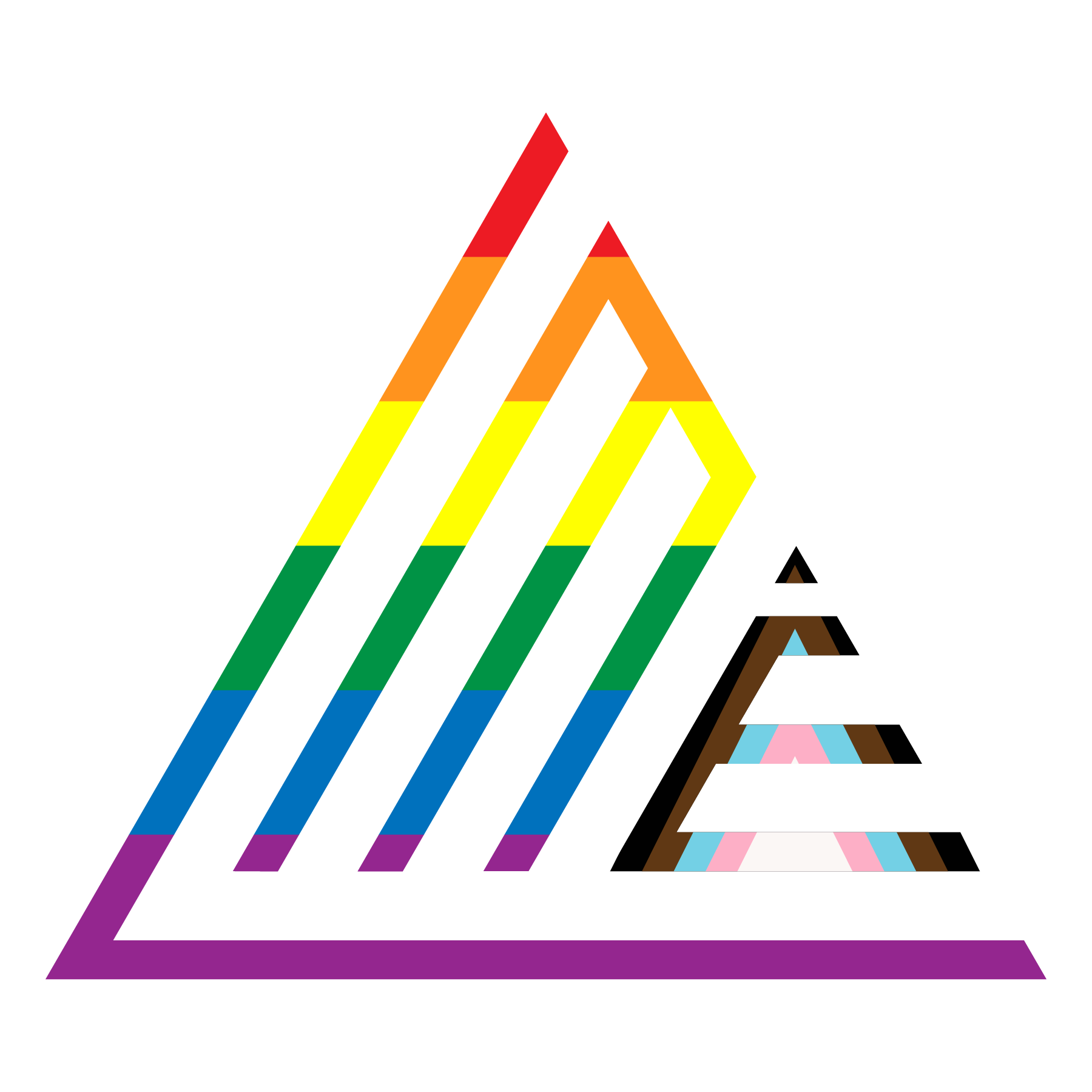
Seasonal marks are approved per campaign, per year. They replace the monogram, never the primary lockup, and only inside the window they were made for.
Every seasonal use needs the brand steward's sign-off before it ships. Do not recolour, extend, or reuse last year's artwork.
Open items
Written but not yet supplied. Each line names what is missing and who closes it.
| Item | Owner | Note |
|---|---|---|
| Vector masters | Brand steward | All lockups are PNG only. AI or EPS needed for print and fabrication. |
| Brand photography | Studio | Section 21 has twelve slots and section 22 four. Drops persist once made. |
| Icon set | Design | The rule is written; the drawn set does not exist yet. |
| Print specifications | Production | Stocks, finishes, spot builds and large-format tolerances. |
| Merch photography | Production | Section 26 specifies the kit; the garments have not been shot. |
| Partner sheet | Brand steward | Section 13 needs approved client lockup pairs, per account. |
| Templates | Design | Deck, proposal and social templates built on the section 20 grid. |